eBanking Dashboard Redesign
Role:
Lead Designer
Platform:
Adaptive Web
EFG, a Swiss private bank, initiated a redesign of its eBanking platform to modernize the interface and improve usability. The goal was to help clients manage daily financial tasks independently and reduce CRO (Client Relationship Officer) requests by 20–30%.
Problem
The previous dashboard felt outdated, overloaded with information, and required too many clicks to access key data. Both clients and internal stakeholders wanted a more intuitive, modern experience that would boost daily active usage and client satisfaction.
MY ROLE:
As part of the EFG Digital Solutions team, I served as Lead Product Designer. I collaborated with Liip, a Swiss research and development agency conducting quantitative user research, to combine their large-scale findings with our internal qualitative insights. I conducted stakeholder interviews at EFG’s Zurich office, synthesized Liip’s data, and turned those insights into prototypes that we tested with bank employees. The final designs became the foundation for a new design system developed with engineers.
Research & Insights
I started with a competitor analysis and a review of modern banking UI trends to identify how other platforms simplify complex data. During stakeholder interviews at EFG’s Zurich office, I discovered that many clients felt overwhelmed by the amount of information on the dashboard and often couldn’t complete simple actions without CRO support. Internal teams also noted that the outdated layout made updates and scalability difficult.
Using these insights, I collaborated with analytics to pinpoint the most visited applications and reorganized the information architecture around those high-value tasks. I then built interactive prototypes and tested them with bank employees to validate flow and terminology. Their feedback revealed that users valued quick access to balances and investment summaries above everything else, which led me to simplify the hierarchy and declutter the interface.
As the design matured, I partnered closely with developers to define reusable UI components and document interaction patterns — laying the groundwork for EFG’s first design system and improving collaboration between design and engineering.
Constraints & Challenges

Design Process
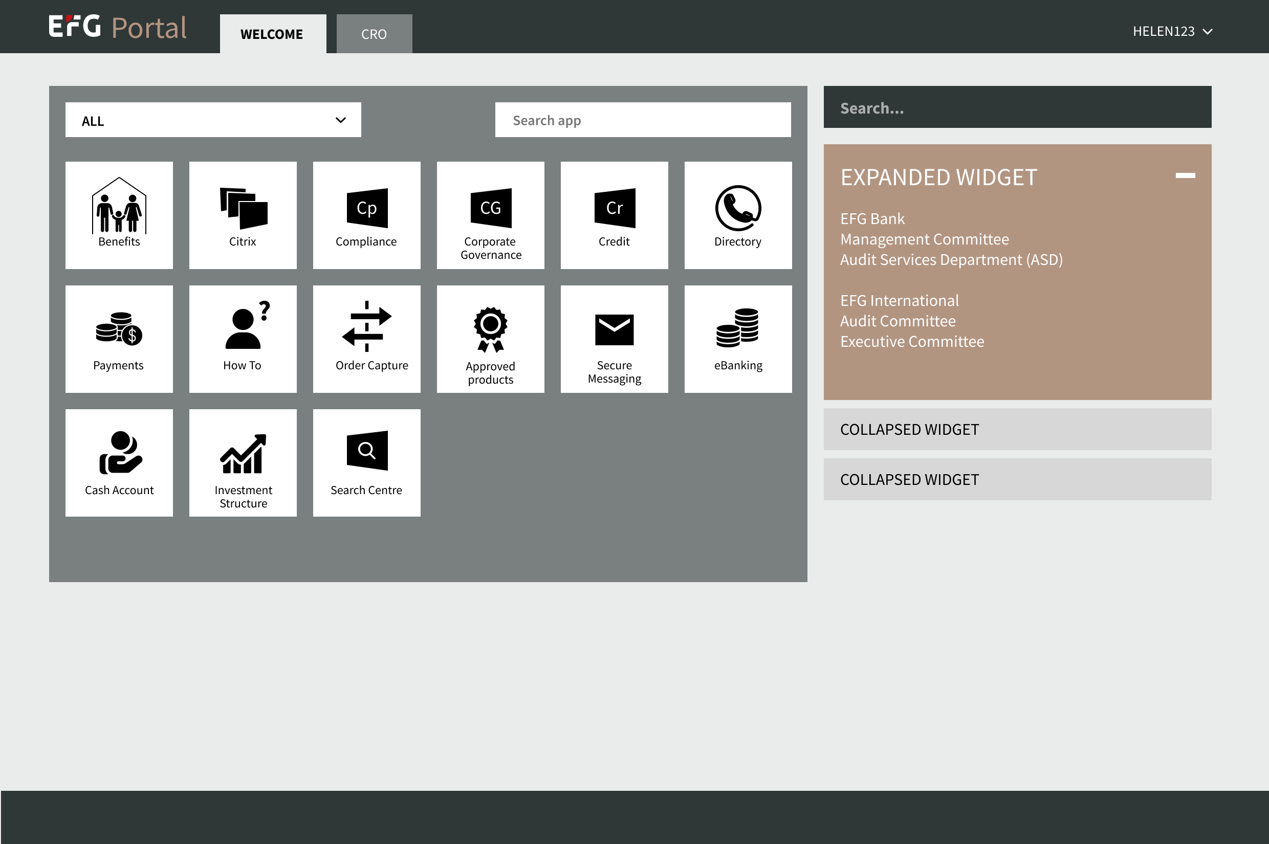
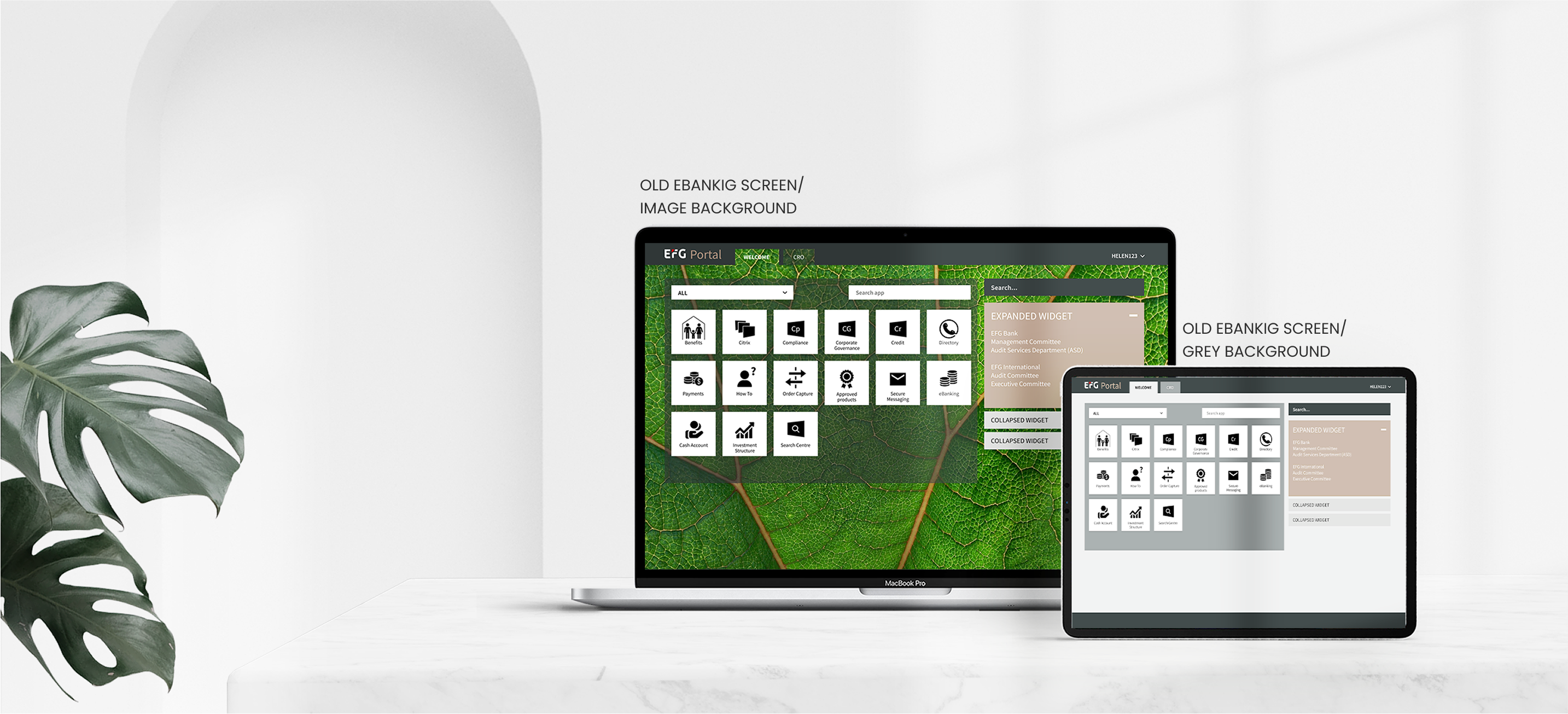
ORIGINAL
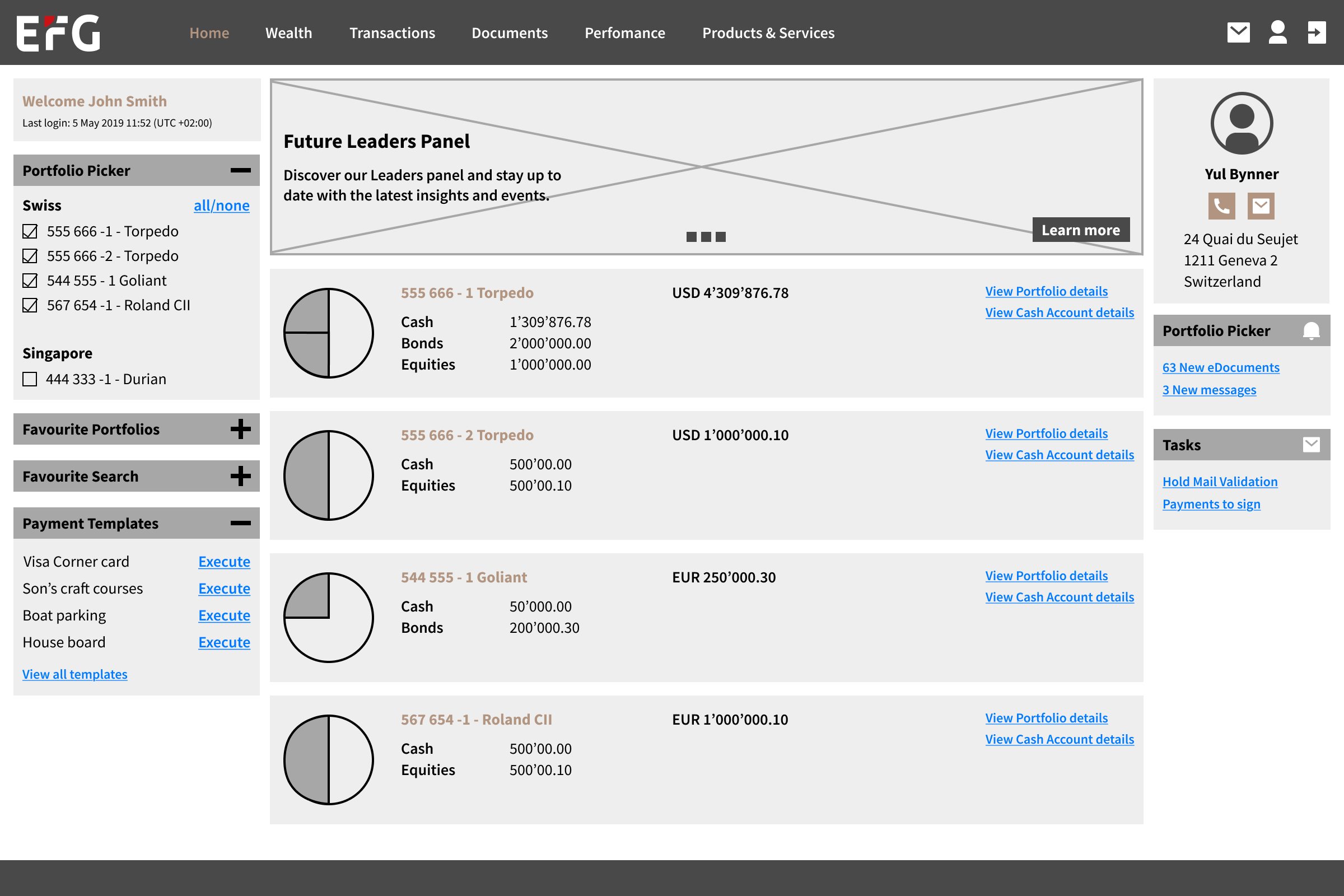
V1
✅ Easy to navigate to Support for Client Advising, it was the pain point from user research
❌ The portfolio area dominates the screen, but the information density is low. For users with fewer portfolios, the layout wastes valuable space.
❌ The portfolio list will likely require scrolling or feel overwhelming if a user has many portfolios.
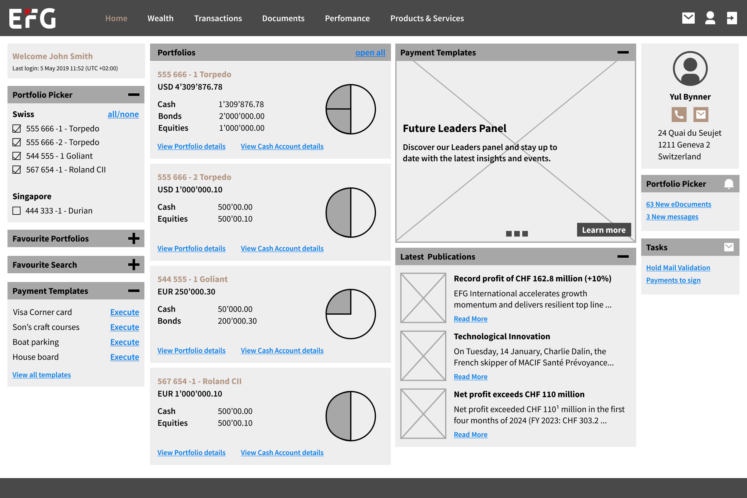
V2
✅ Easy to navigate to Support for Client Advising, it was the pain point from user research
✅ If the client has more than 4 Portfolios, we create a page that navigates to all portfolios' list
❌ The solution has a dense layout with multiple sections competing for attention. This can overwhelm users, especially those unfamiliar with the interface.
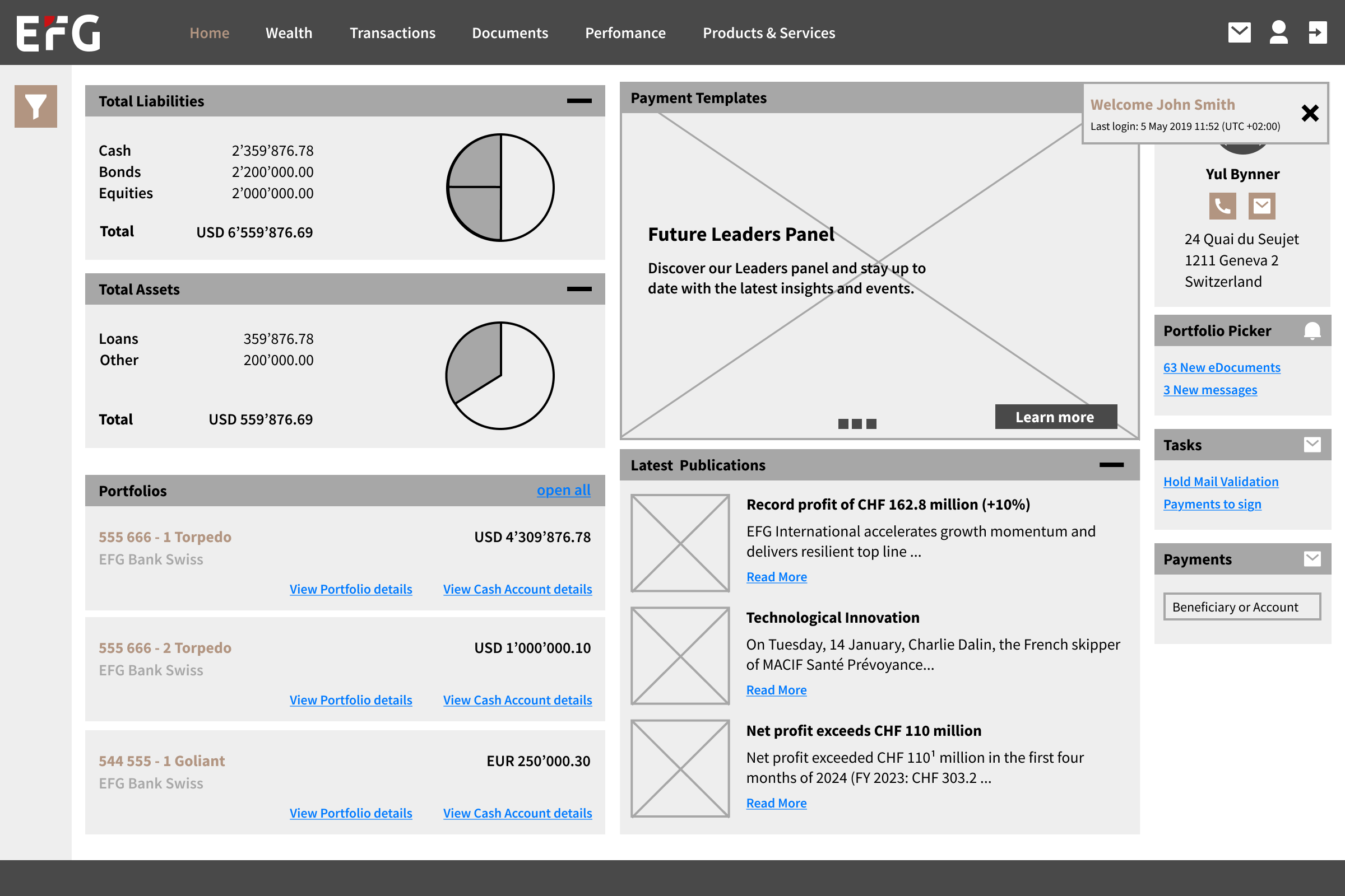
V3
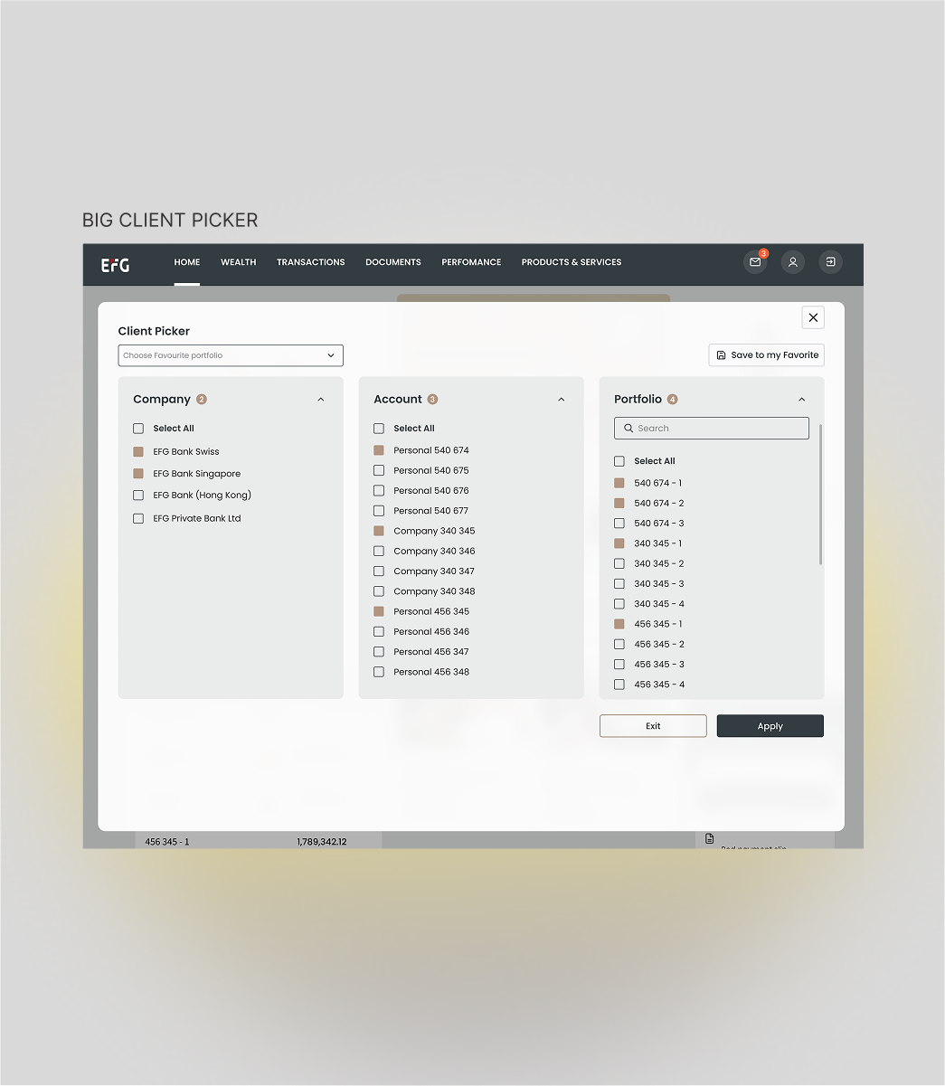
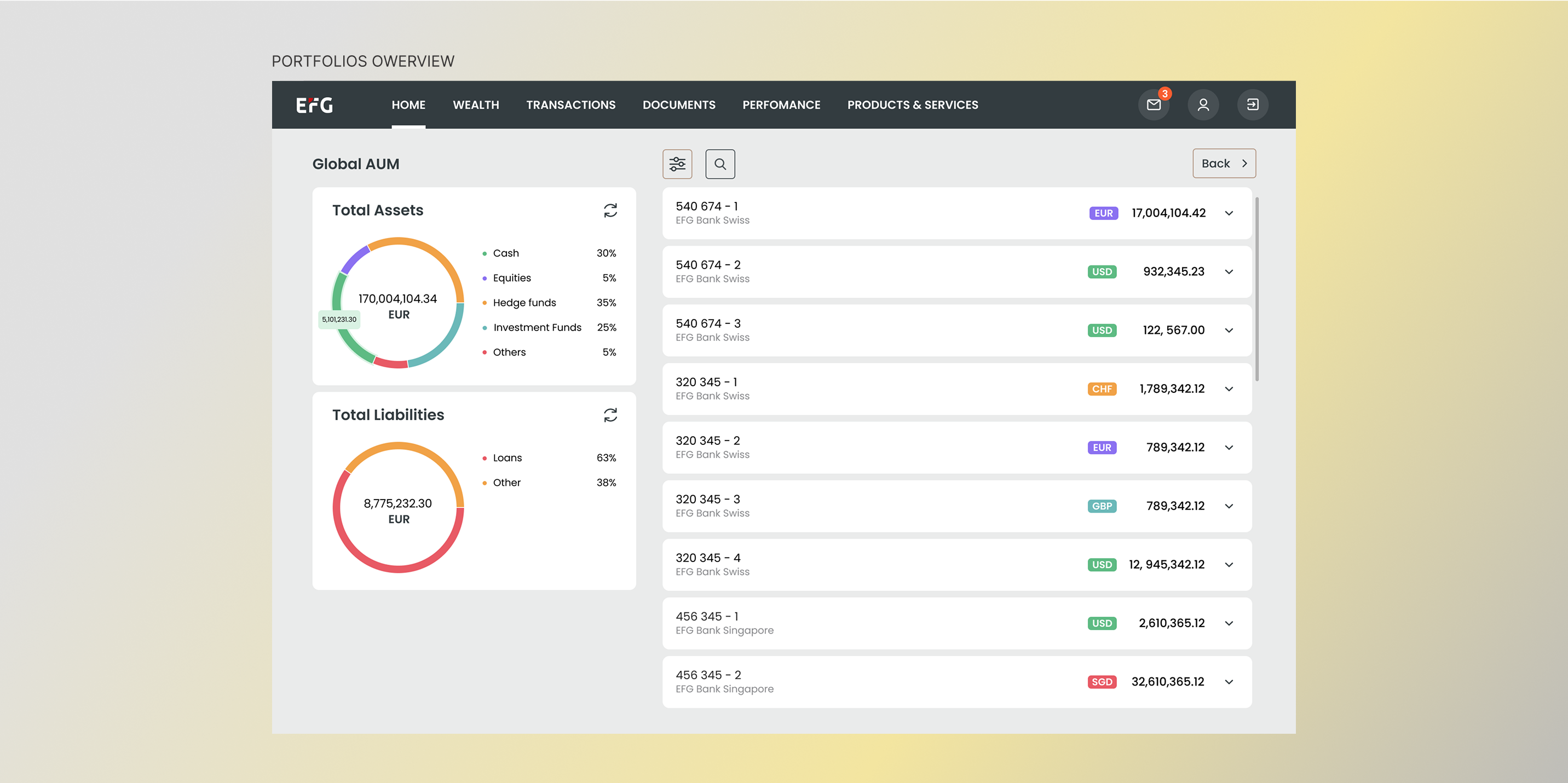
✅ The layout follows a left-to-right hierarchy: portfolio overview on the left (the most-checked information), an Info Box for updates in the centre, and help functions on the right. This structure aligns with users' reading habits and keeps the main interface uncluttered, enhancing efficiency and personalisation.
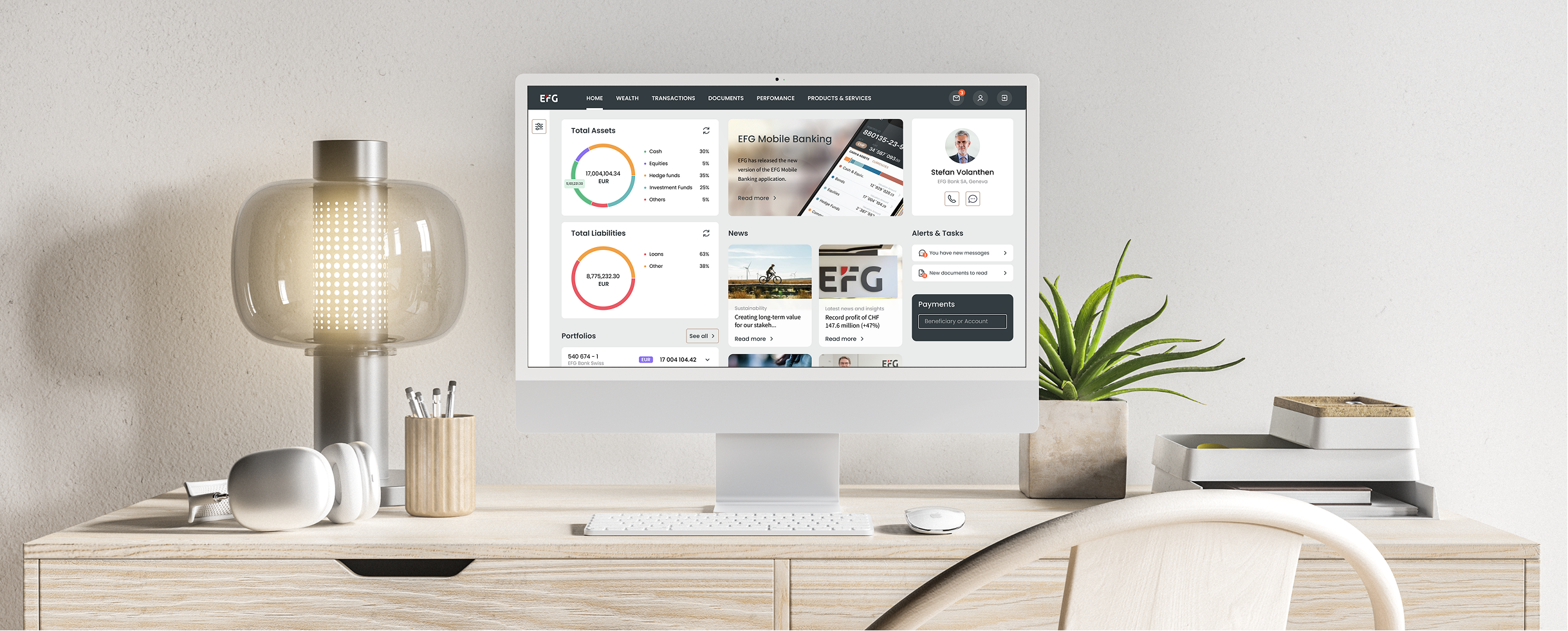
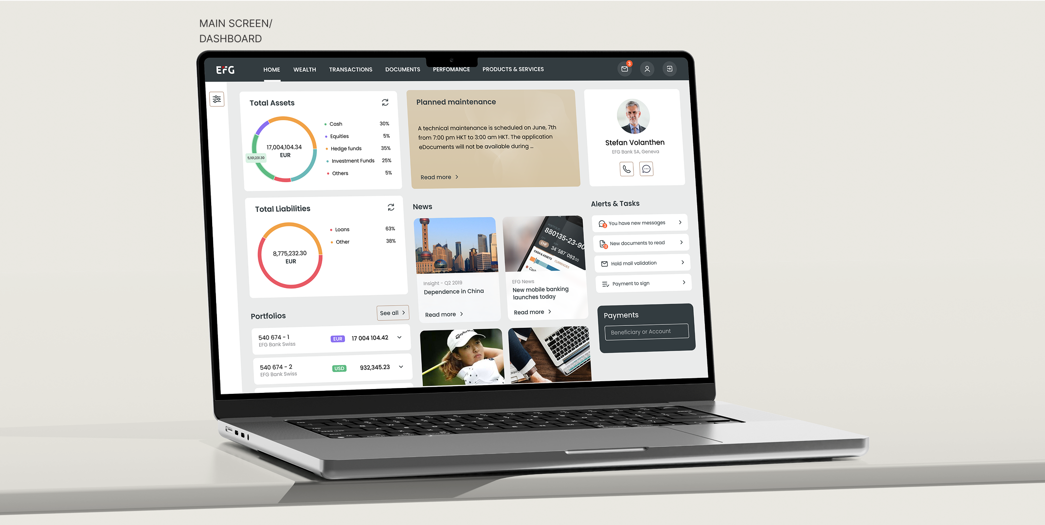
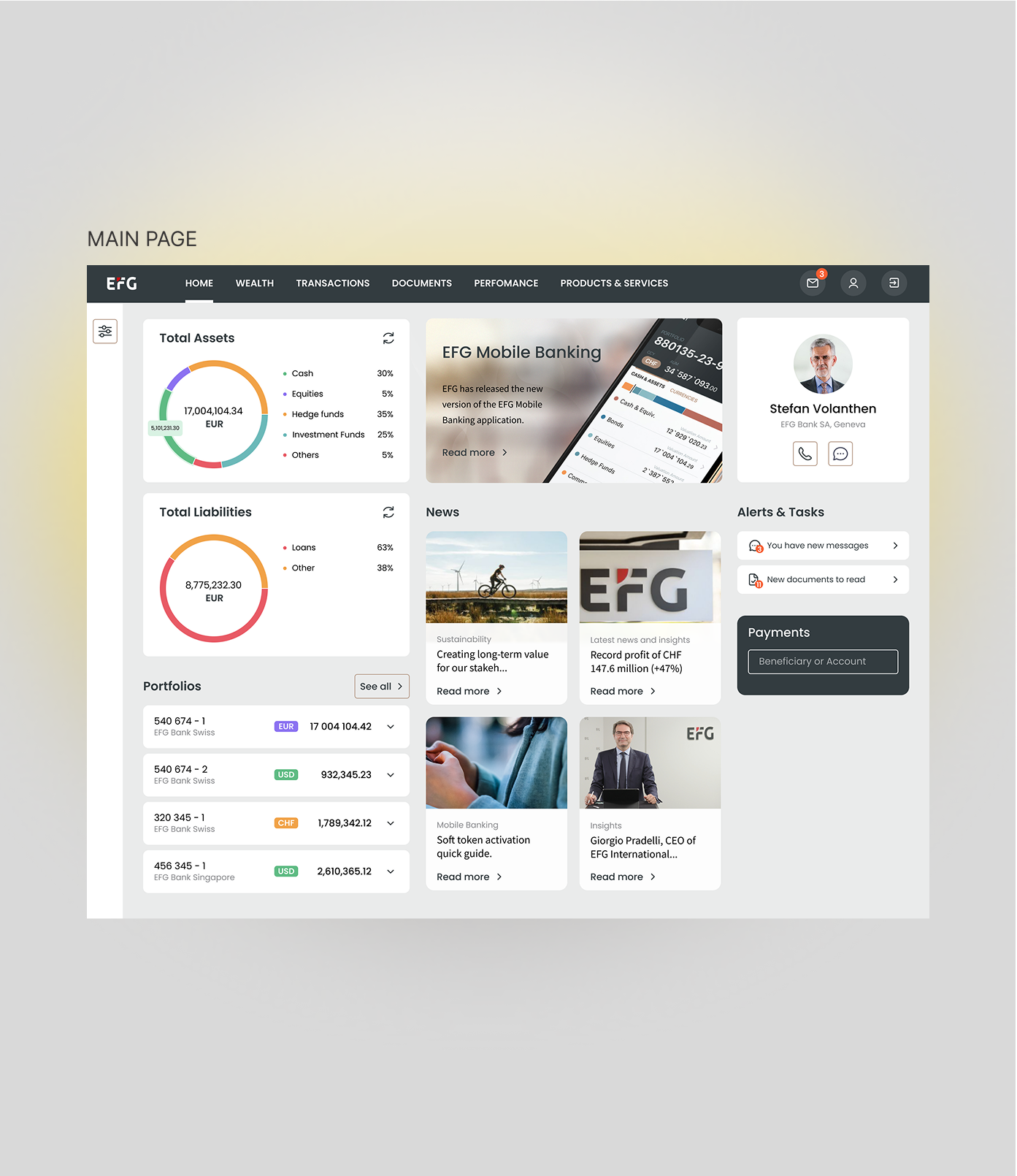
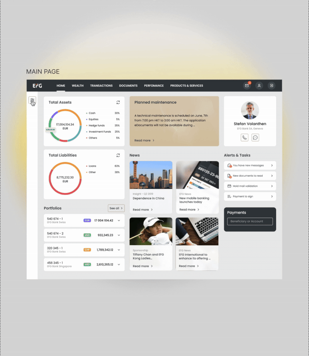
Solution
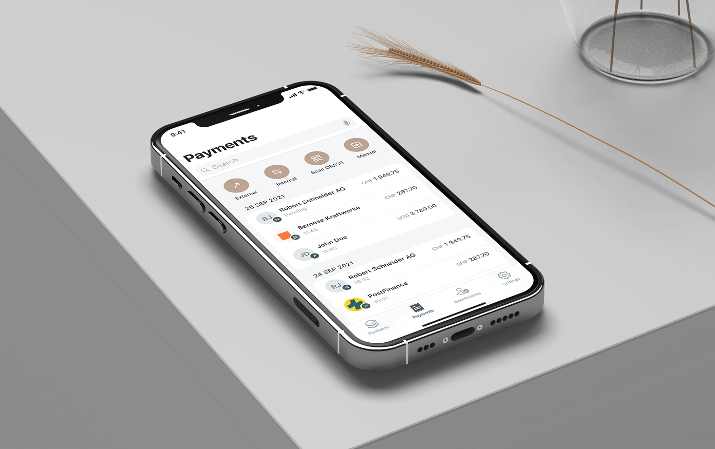
The final dashboard focused on clarity and task efficiency. I reorganized the layout to surface the most-used actions — portfolio overview, payments, and investments — and minimized steps for core flows.
KEY IMPROVEMENTS:

Outcome
The redesign made information easier to find and significantly improved task efficiency.
REFLECTIONS:
This project taught me the importance of designing for both usability and scalability. By involving stakeholders early and validating with internal users, I balanced business expectations with real user behavior and helped build a foundation for consistent, efficient design at EFG.