Mobile Payments UX Redesign
Role:
Product Designer
Platform:
Mobile (iOS + Android)
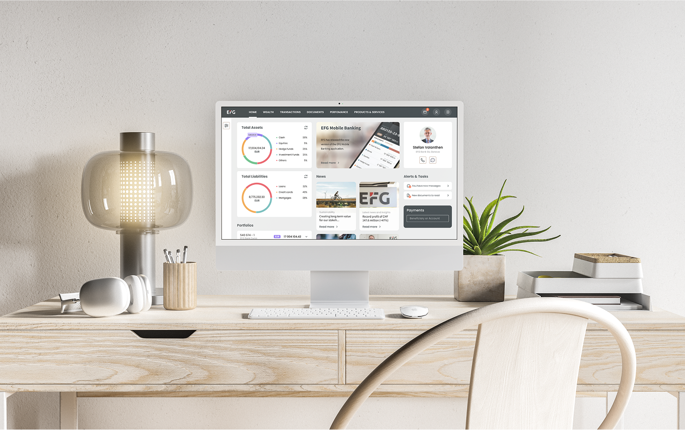
EFG aimed to bring full payment functionality from desktop to mobile, allowing clients to complete transactions on the go while maintaining high security and compliance standards. The goal was to enable users to make and confirm payments directly from their phones and reduce dependency on desktop workflows and CRO (Client Relationship Officer) support.
Problem
At that time, the bank didn’t have a native mobile payments solution. Clients could initiate some transfers on desktop, but for security reasons, certain transactions required co-signing by a second account owner — something that couldn’t be done on mobile. When one client made a large transfer, the other had to log in from a computer to confirm it within a limited time window. This caused frustration and repeated failed attempts.
Business stakeholders wanted to bring this flow to mobile, balancing convenience and compliance while ensuring users could complete tasks securely without timeouts or technical issues.
MY ROLE:
In this project, I worked closely with data, stakeholders, and development teams. I collaborated with both the Payments Product Owner and Mobile Product Owner to understand technical and security constraints as well as client pain points. This knowledge helped me design a mobile experience aligned with the web process while optimizing it for on-the-go usage.
I built the information architecture, created prototypes, and designed the final UI for both iOS and Android platforms.
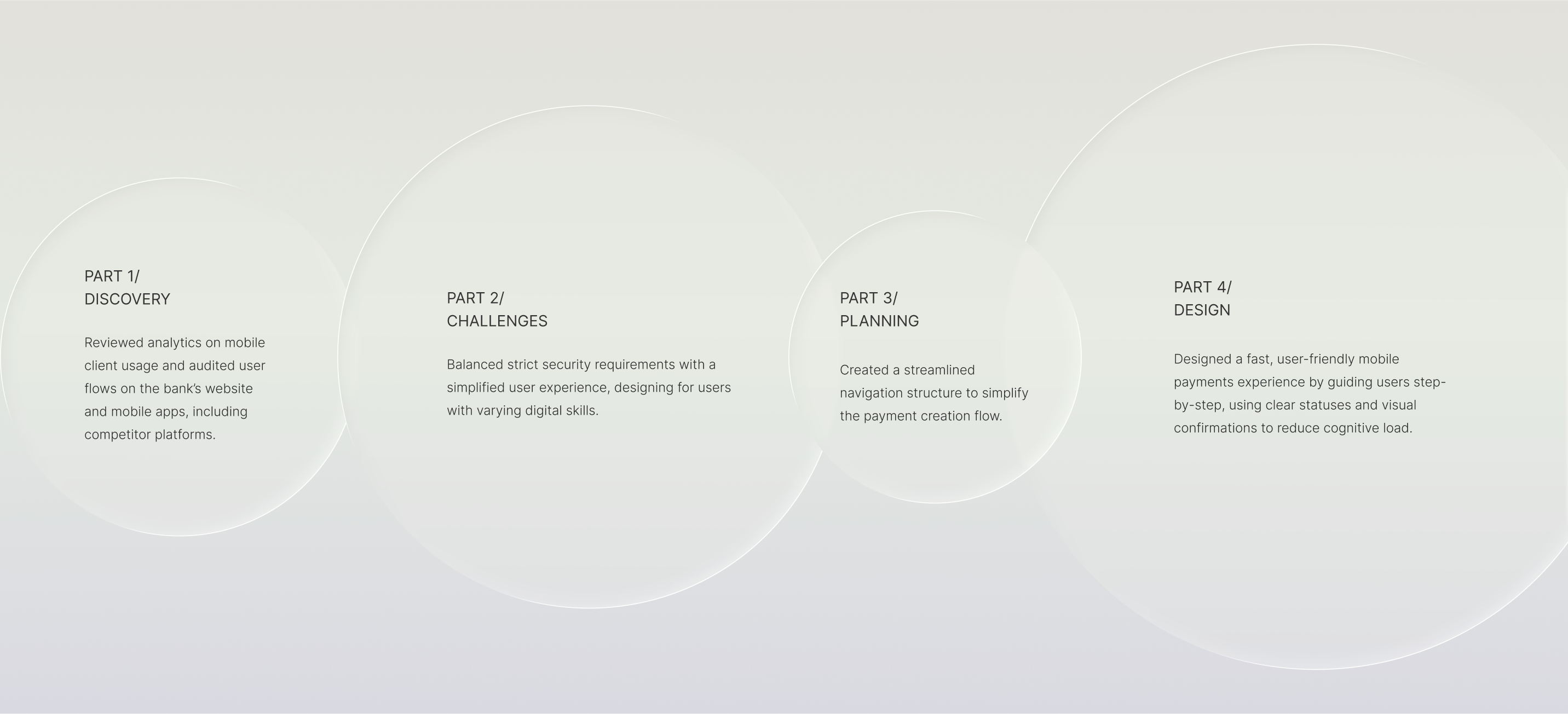
Research & Insights
The timeline for this project was short, so I began by aligning closely with both product owners to clarify technical limitations, legal requirements, and user expectations. Understanding the strict structure of banking payments was critical to balance security with task simplicity.
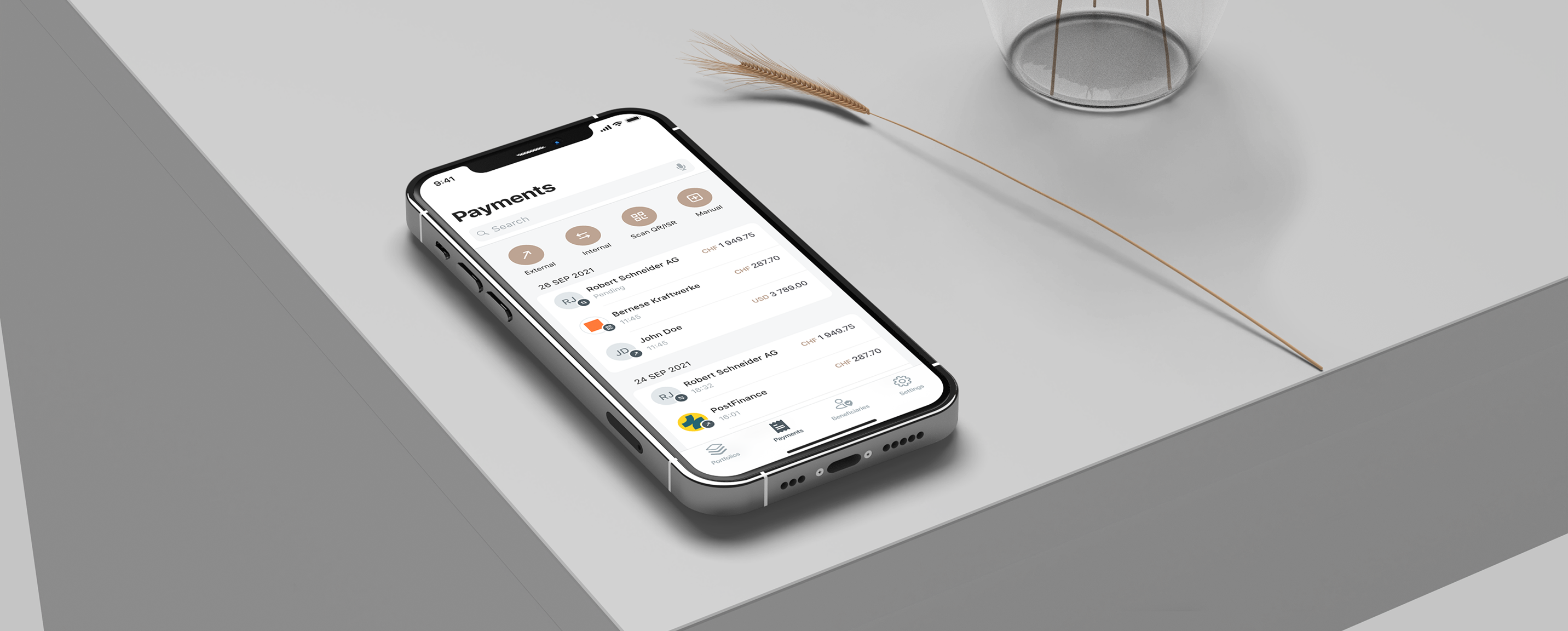
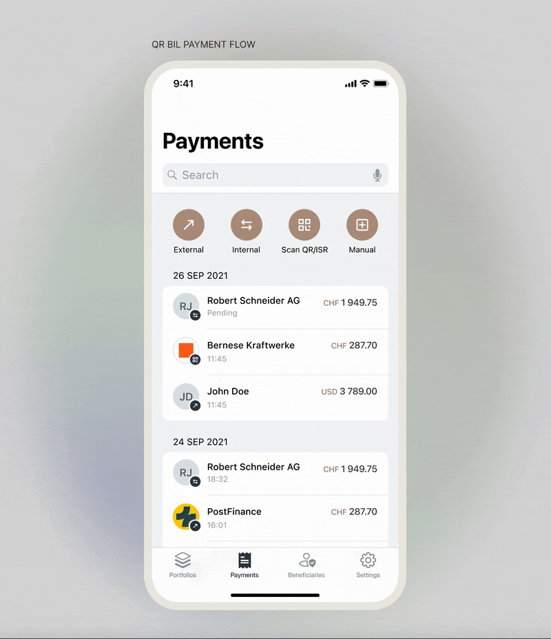
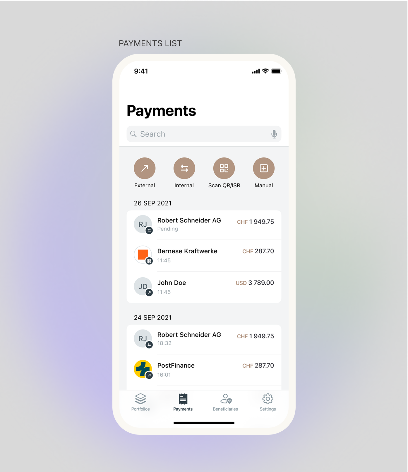
I mapped the full process in a detailed information architecture diagram, which helped surface potential edge cases early and guided our MVP planning. We decided to start with the “Scan Orange Payment” feature — a high-frequency task that allowed users to scan invoices and test the end-to-end experience quickly.
I created prototypes that were validated by the product owners and the security team to ensure both compliance and usability. The first version was designed for iOS, since 55% of active users were on that platform, followed by Android adaptation.
Constraints & Challenges
Design Process
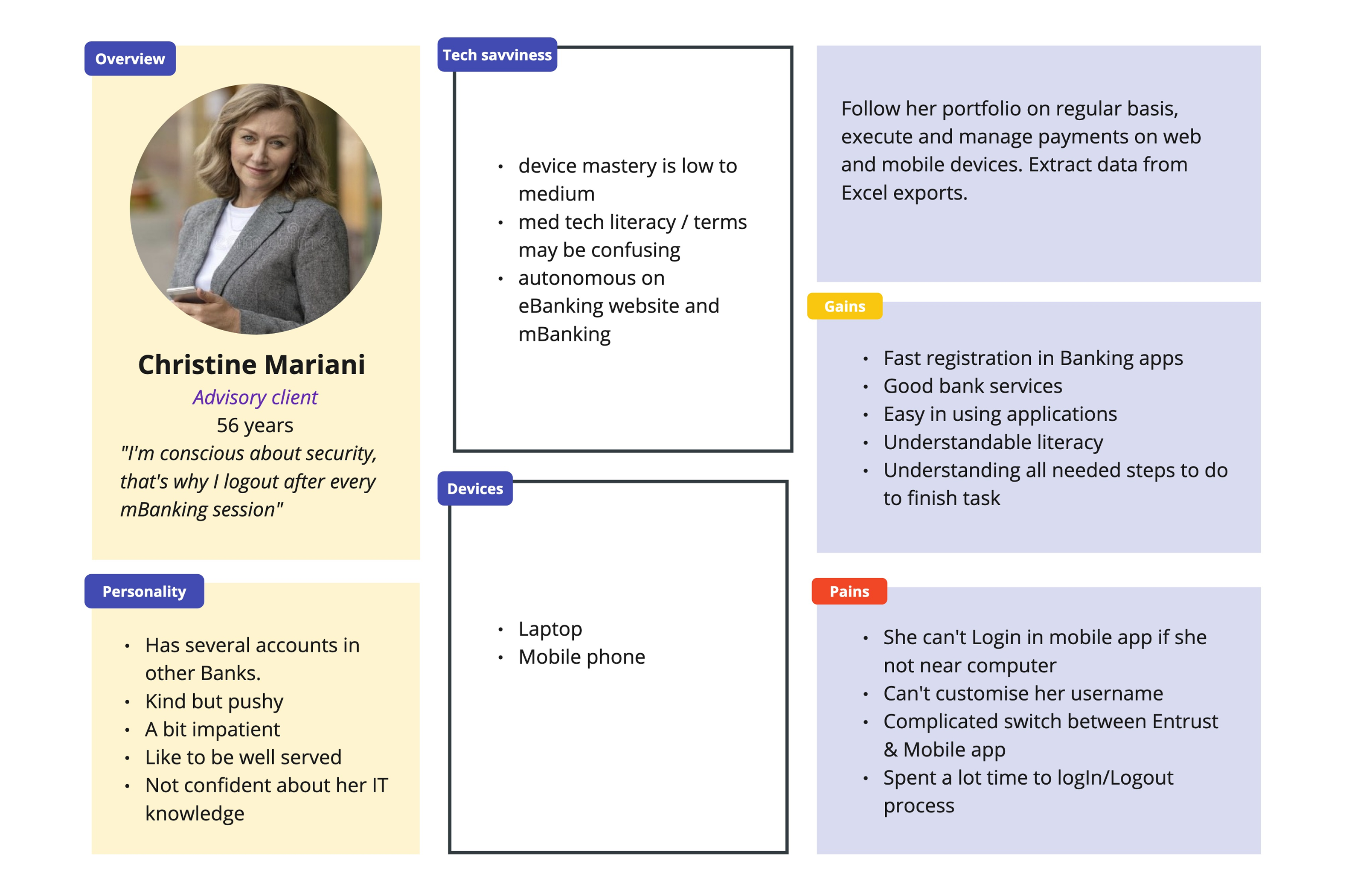
PERSONA 1
A security-conscious user with moderate tech skills who uses mobile banking regularly but finds login processes complicated and time-consuming.
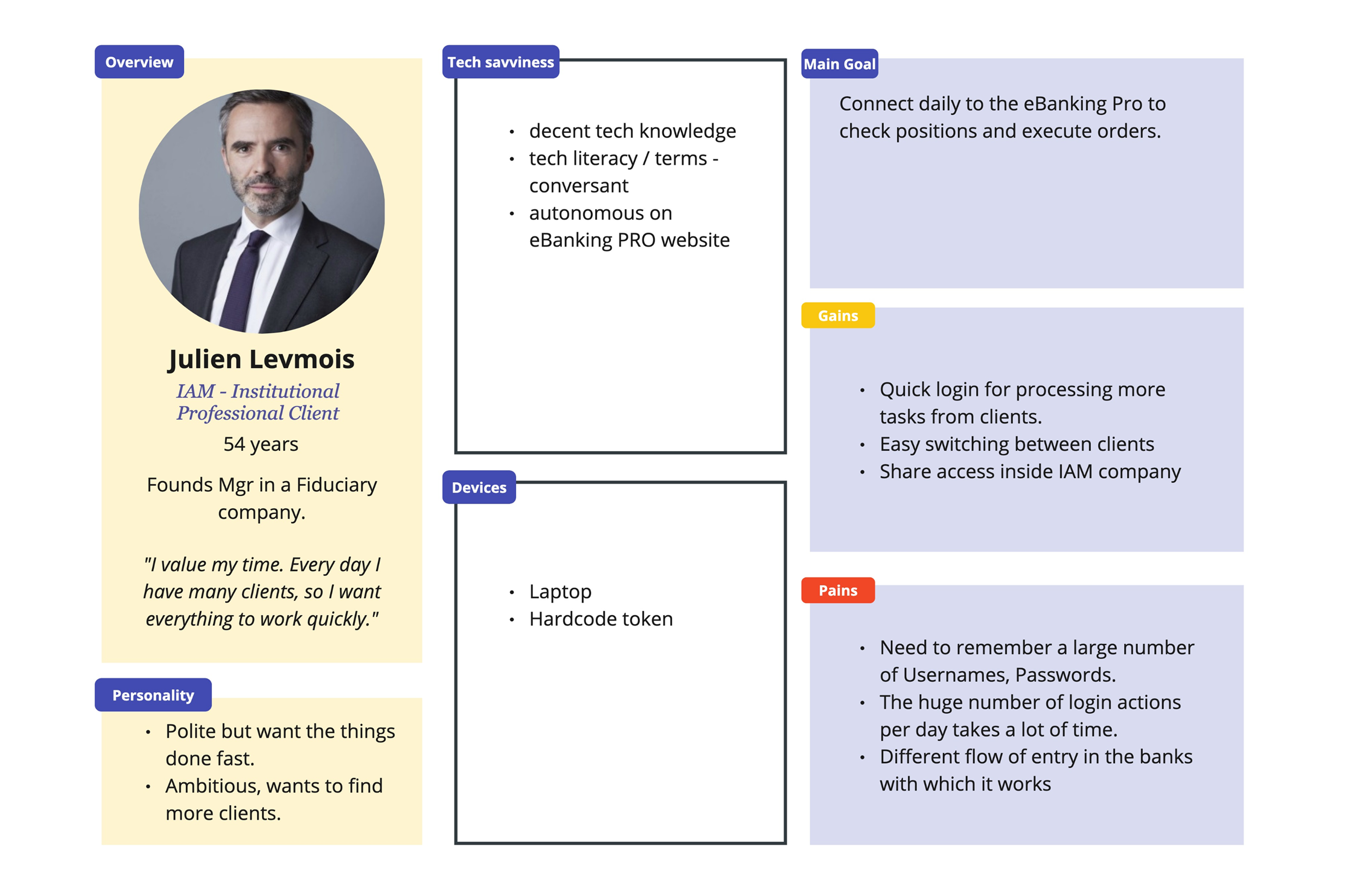
PERSONA 2
A fast-paced professional who relies on efficient mobile access to manage multiple clients but is slowed down by repetitive logins and credential management.
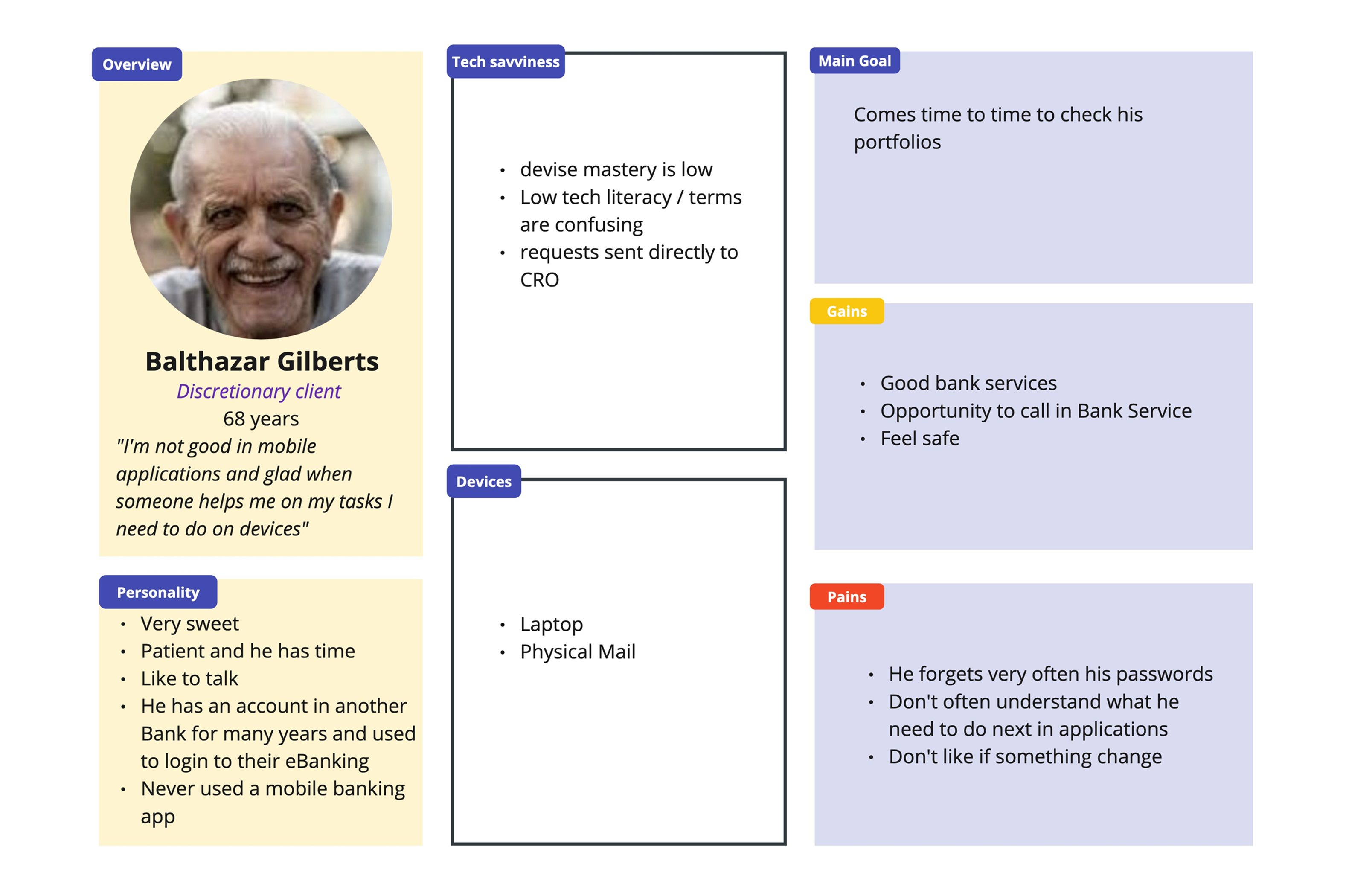
PERSONA 3
An elderly user with very low tech confidence who avoids mobile banking and prefers human support and traditional channels.
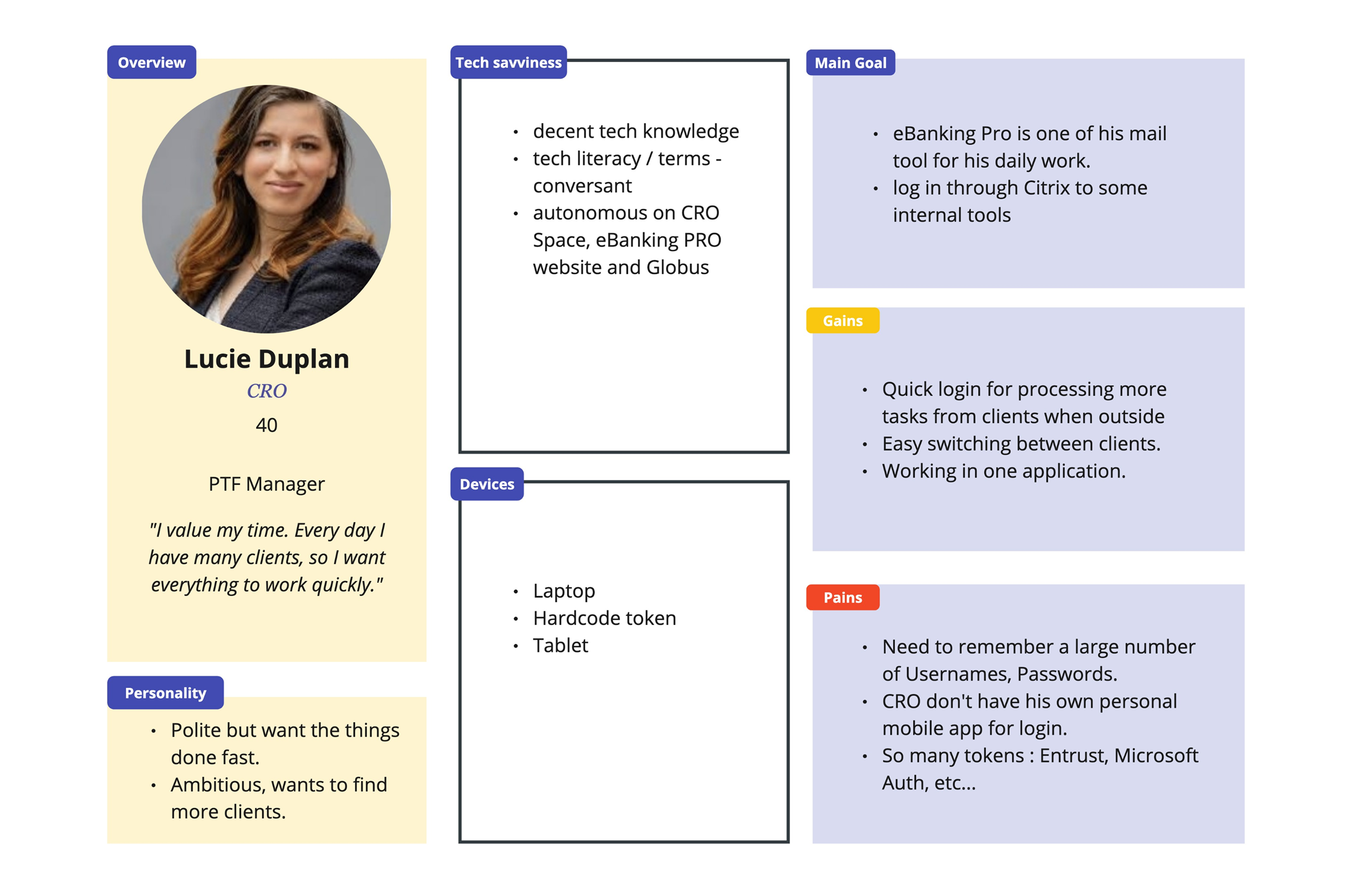
PERSONA 4
A tech-savvy professional who uses mobile banking on the go but is hindered by fragmented access and too many authentication tools.
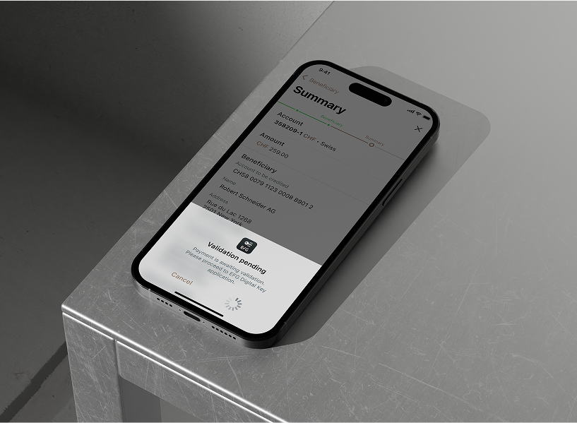
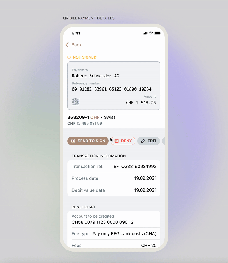
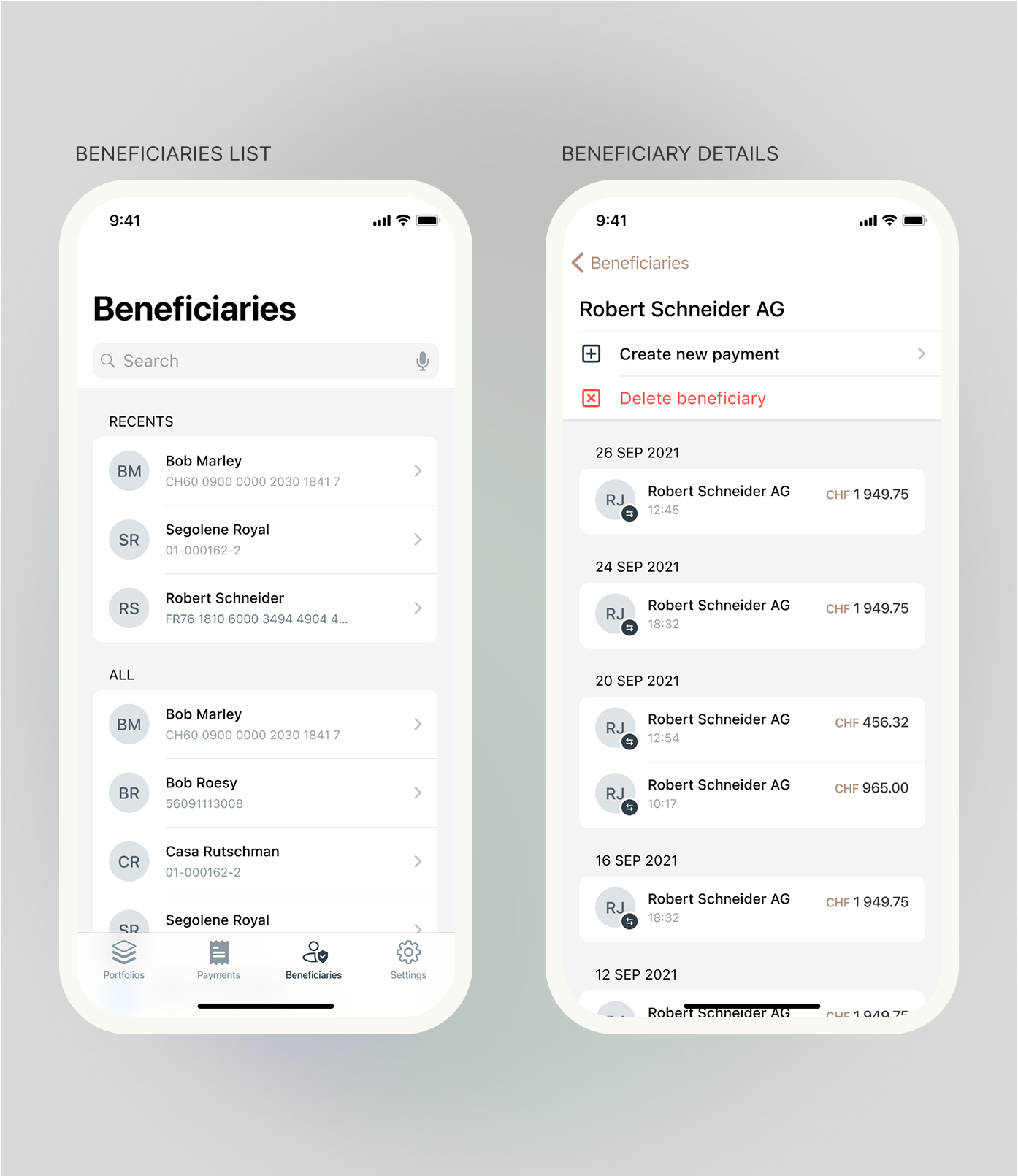
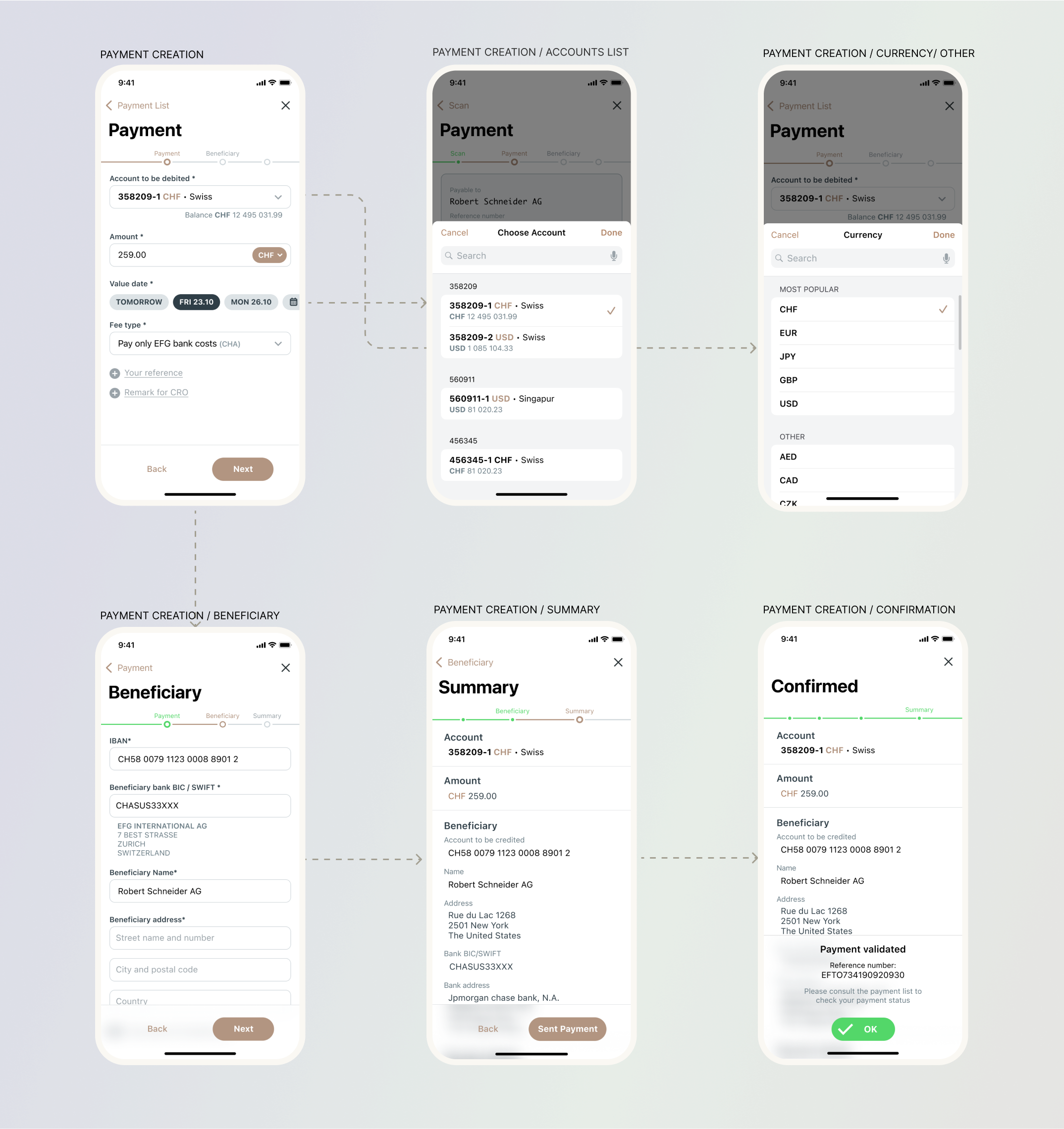
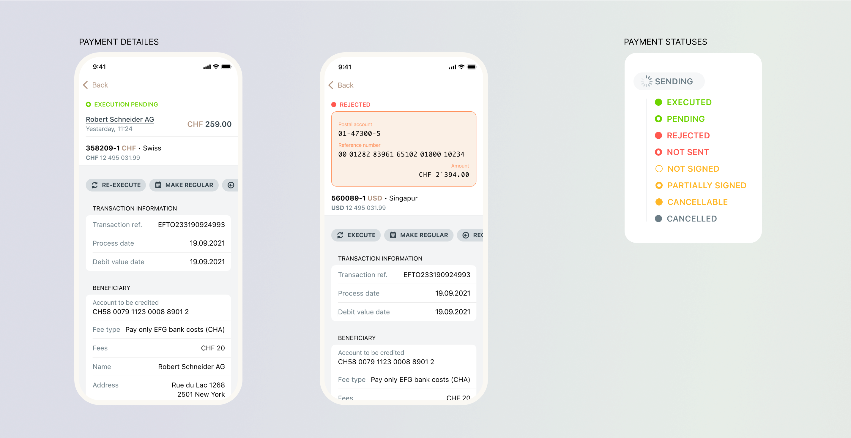
Solution
The final mobile payments design allowed users to initiate, review, and confirm transactions directly on their phones — including multi-owner approvals.
KEY IMPROVEMENT:

Outcome
REFLECTIONS:
This project strengthened my ability to design within strict technical and regulatory boundaries. It taught me how early collaboration with product and security stakeholders helps transform complex, rule-heavy processes into smooth user experiences — while maintaining trust and compliance.