Login Flow Strategy & Redesign
Role:
Product Designer
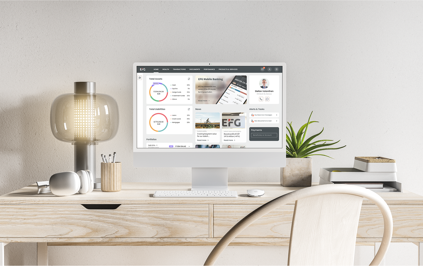
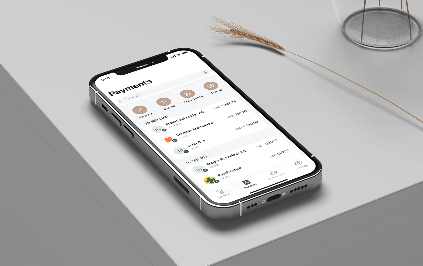
Platform:
Web + Mobile
The existing login and authentication flow for the banking app was causing friction for users, especially in multi-factor & recovery scenarios. The goal was to streamline access, reduce login abandonment, and build trust in authentication — all while maintaining security protocols.
Problem
THIS EXPERIENCE CAUSED A SIGNIFICANT DROP-OFF USER RETENTION AND SATISFACTION.
MY ROLE:
I acted as the Product/UX Designer for this initiative. I collaborated with product owners, security engineers, and devs to understand constraints and user needs. I led the design of new login/user recovery flows, prototyping, validating with internal users, and creating interface specs for both mobile and web.
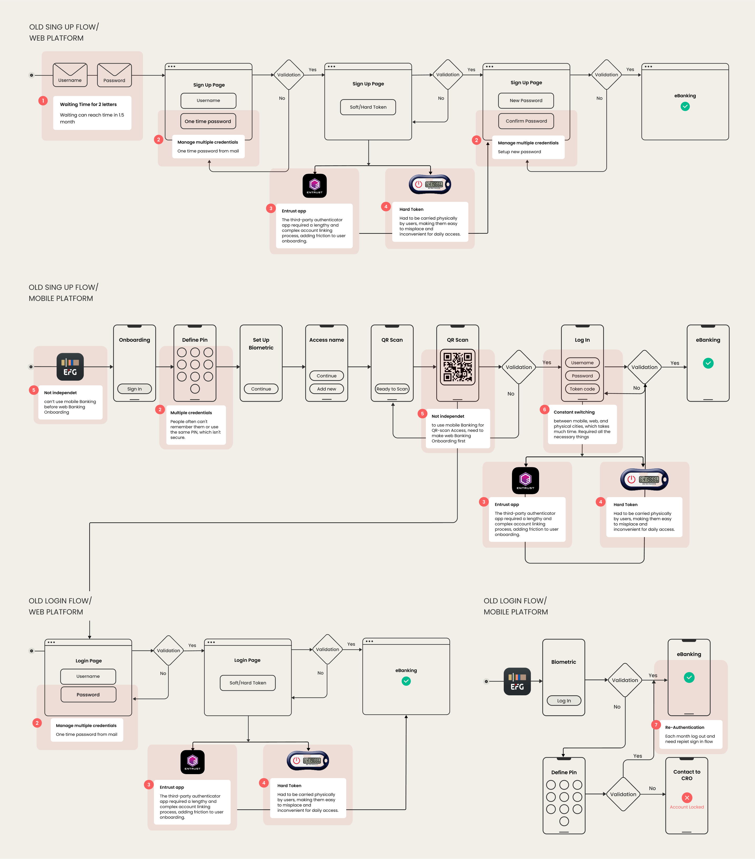
Research & Insights
Constraints & Challenges
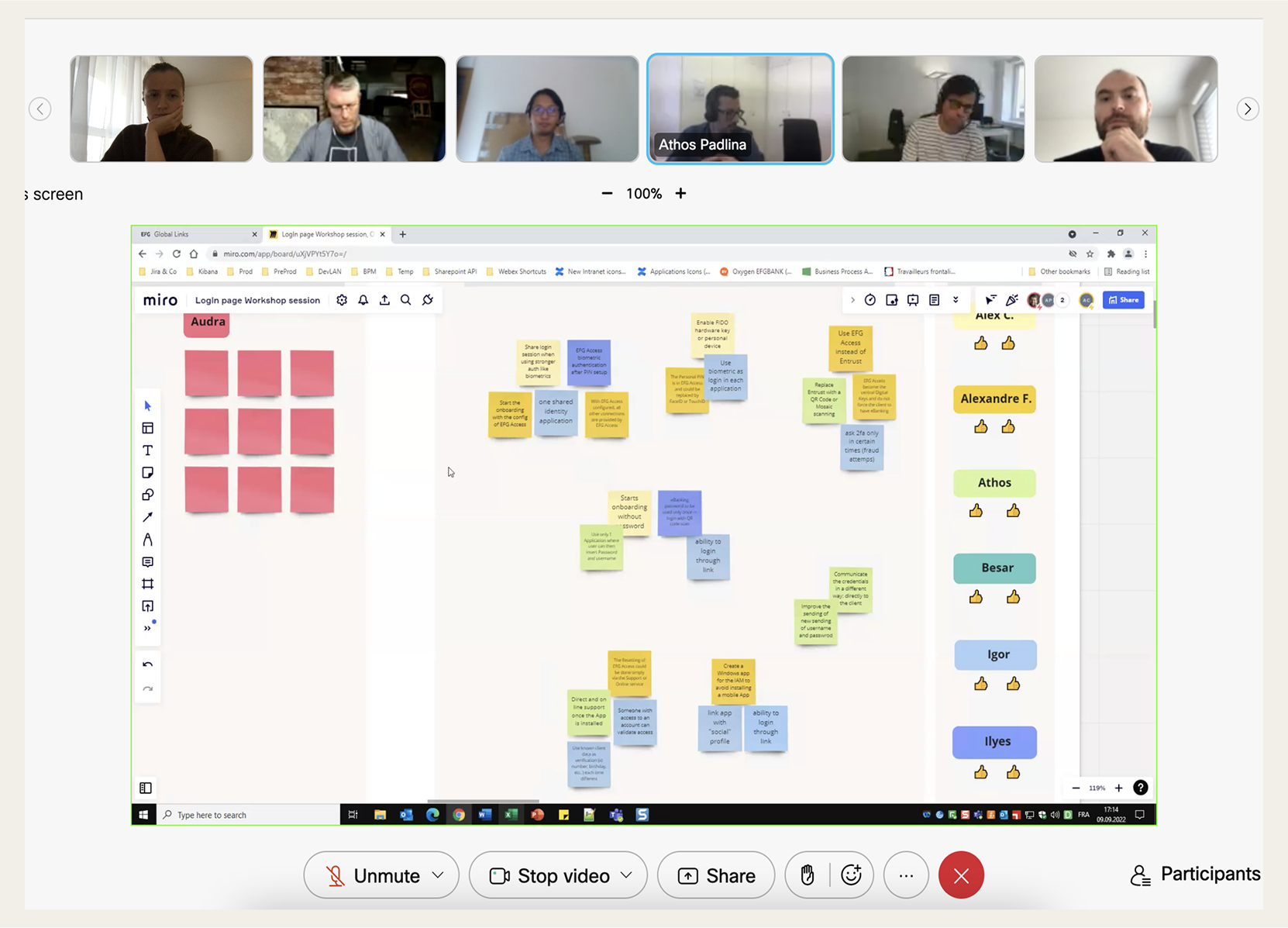
Design Process
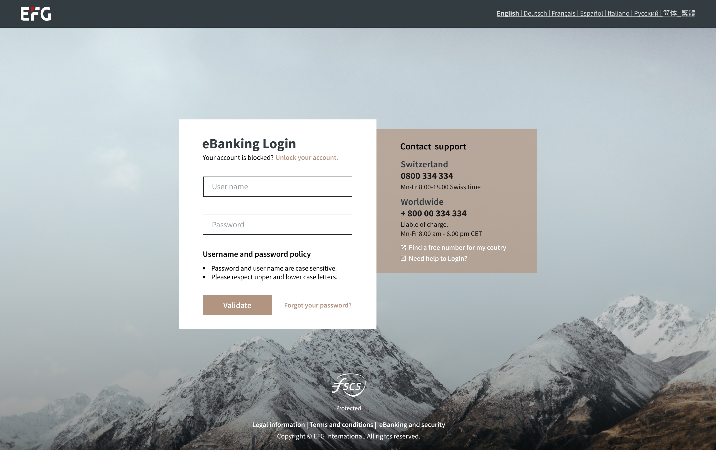
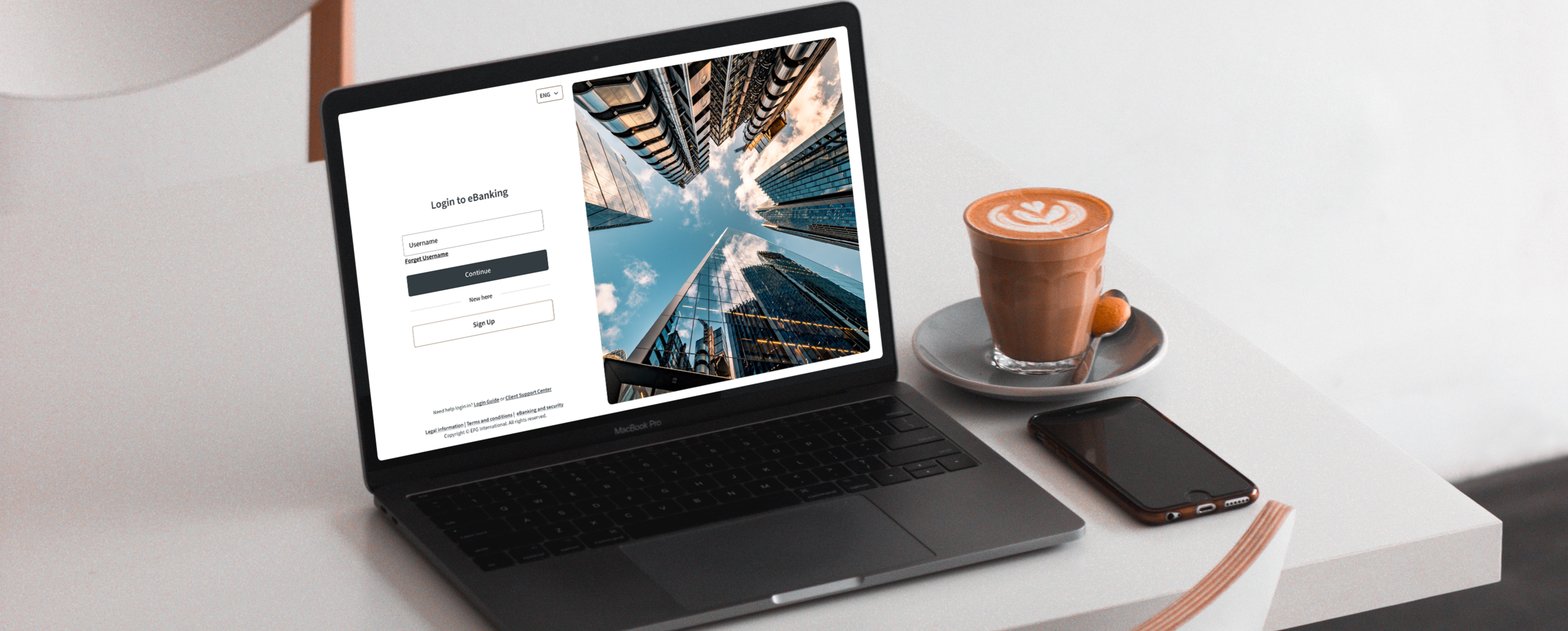
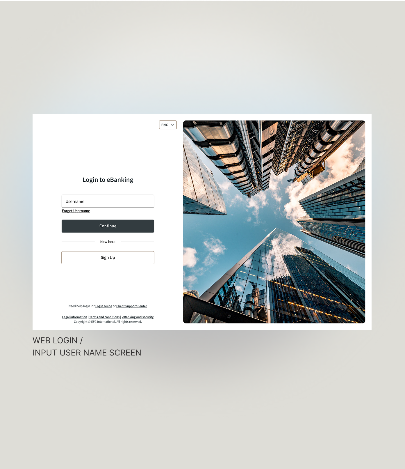
FIRST SCREEN
1. Poor contrast on support text: White text on grayish background isn't very readable, especially for visually impaired users.
2. Information overload at the login moment. The right-hand block is large and dense.
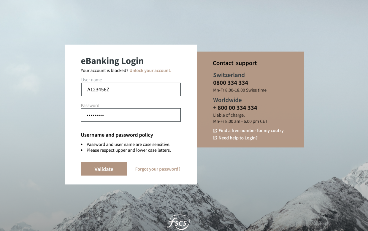
FILLED CREDENTIALS
3. No Password Visibility Toggle:
The password field lacks a "show/hide" option, which is now a standard feature to prevent login errors.
4. Unclear CTA Button Label: The label "Validate" doesn't match user intent. It’s technically accurate but not user-friendly.
5. Missing Sign-Up Option: There is no "Sign Up" or "Create Account" option visible on the login screen.
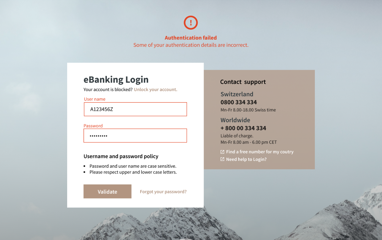
ERROR MESSAGE
6. The error message lacks visual emphasis due to its non-standard placement and low-contrast red text on a muted background, making it easy to overlook.
7. Emotionally harsh tone: Feels accusatory and unhelpful and no contextual help.
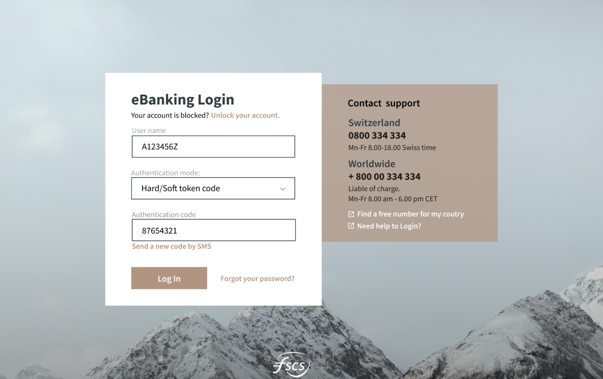
AUTHENTICATION SCREEN
8. Inconsistent Login Methods: Switching between “Password” and “Hard/Soft Token” login methods causes a shift in the interface with no clear context or explanation.
9. Terminology may be unclear. Terms like “Authentication mode” may not be familiar to less tech-savvy users.
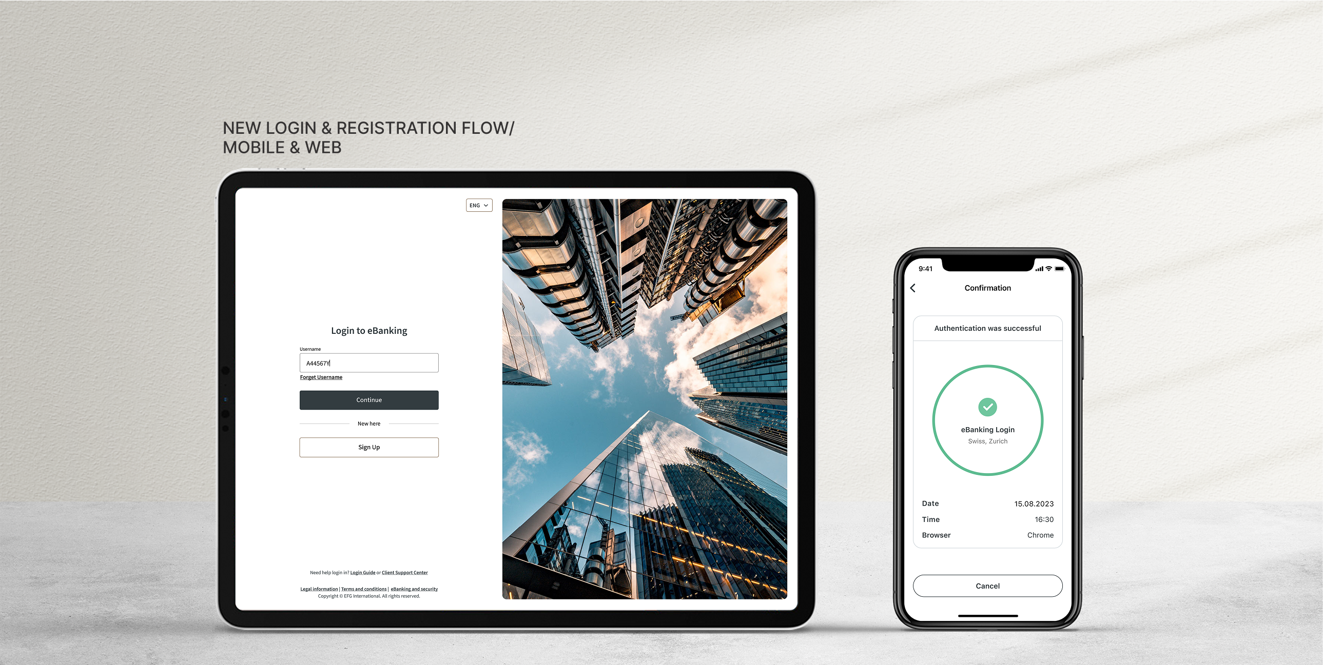
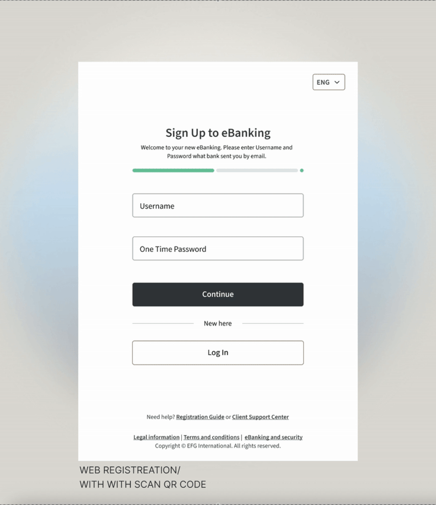
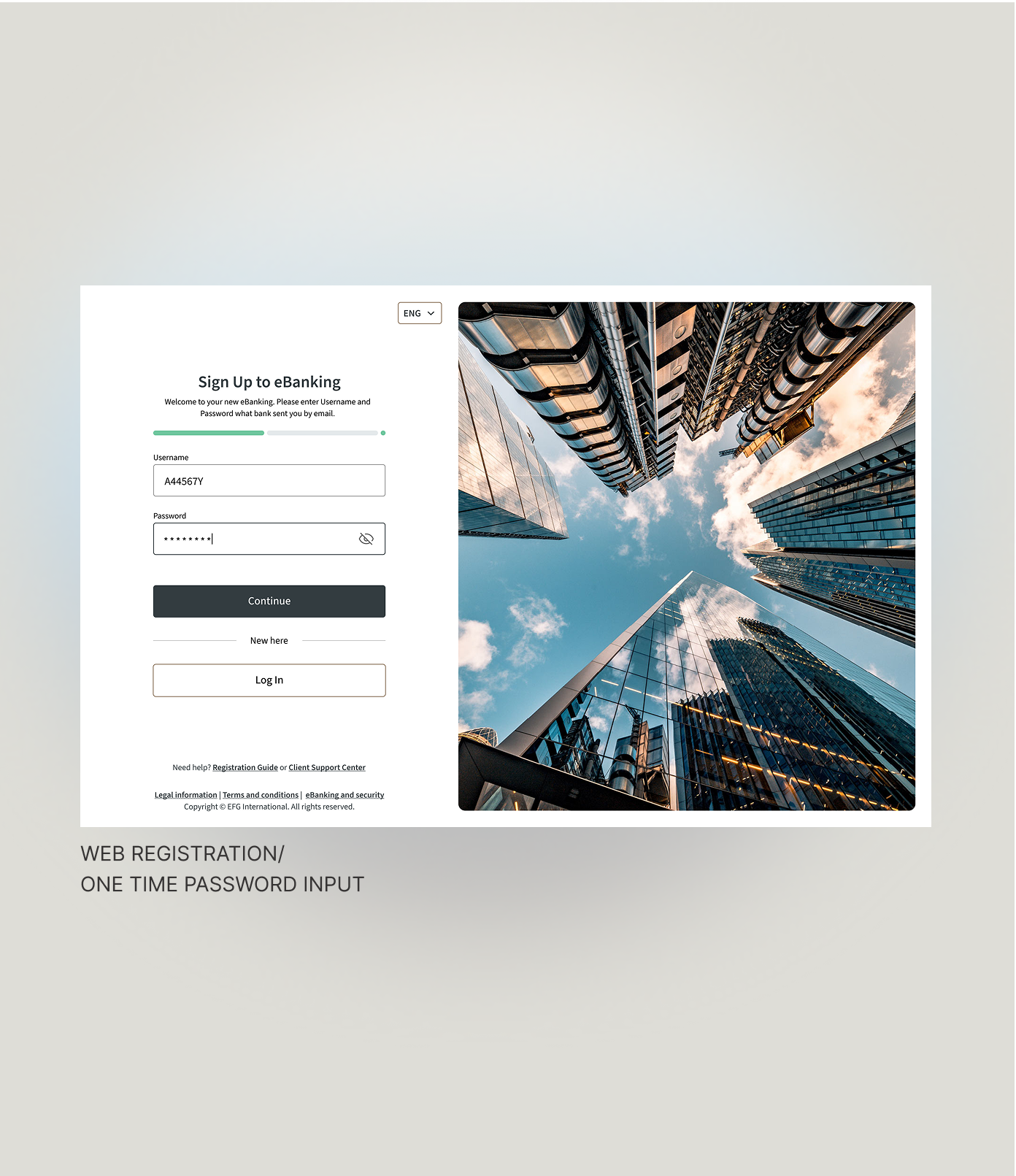
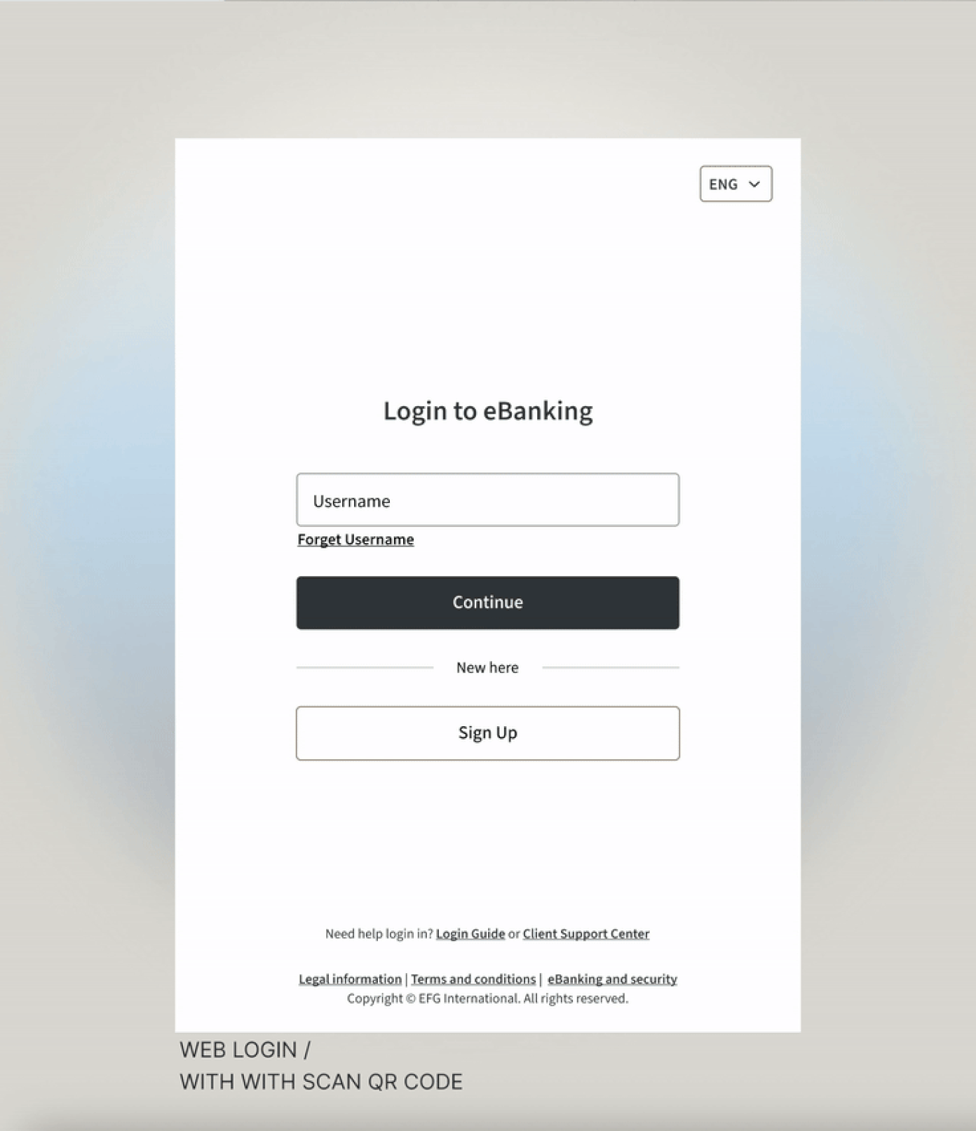
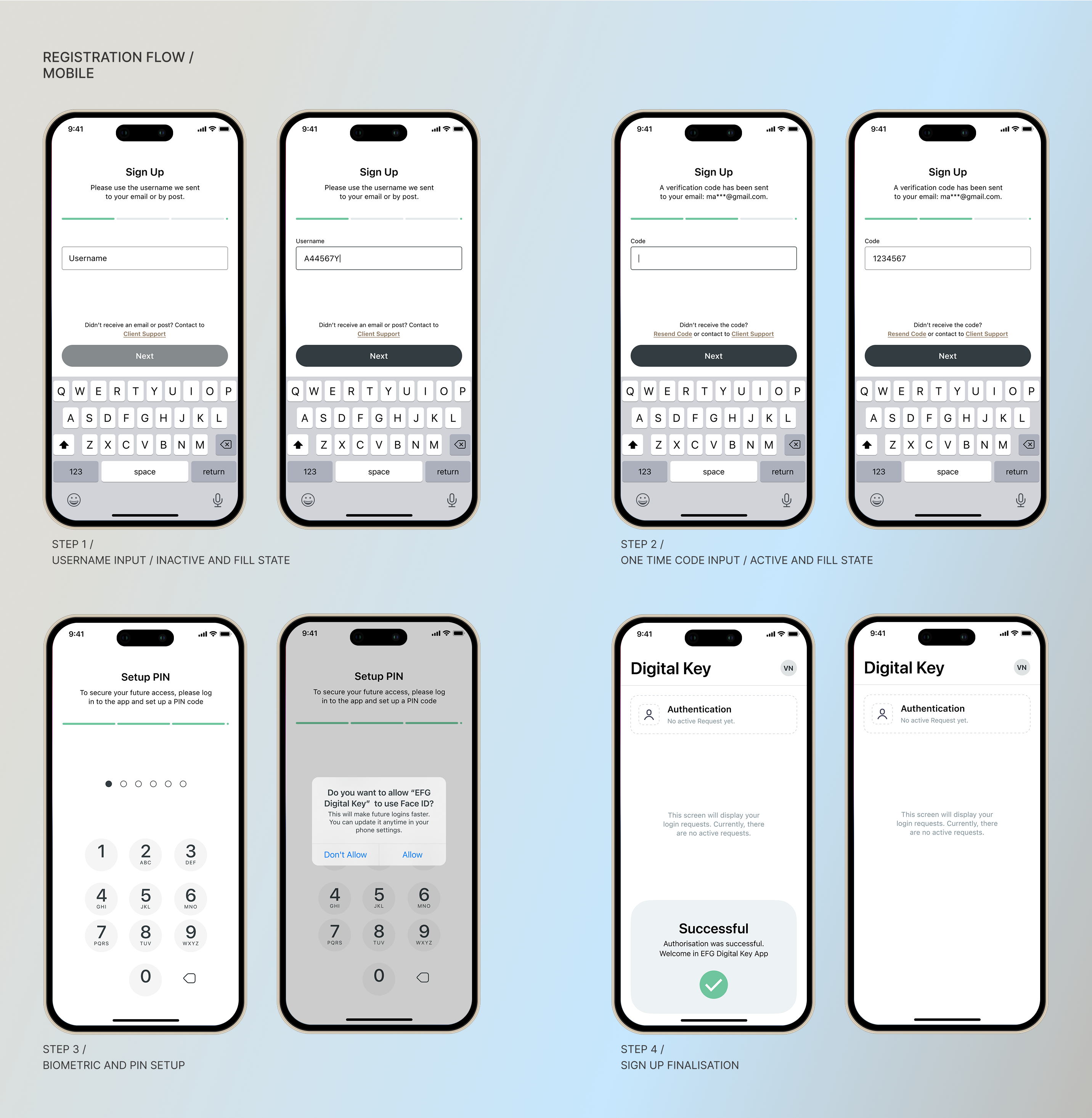
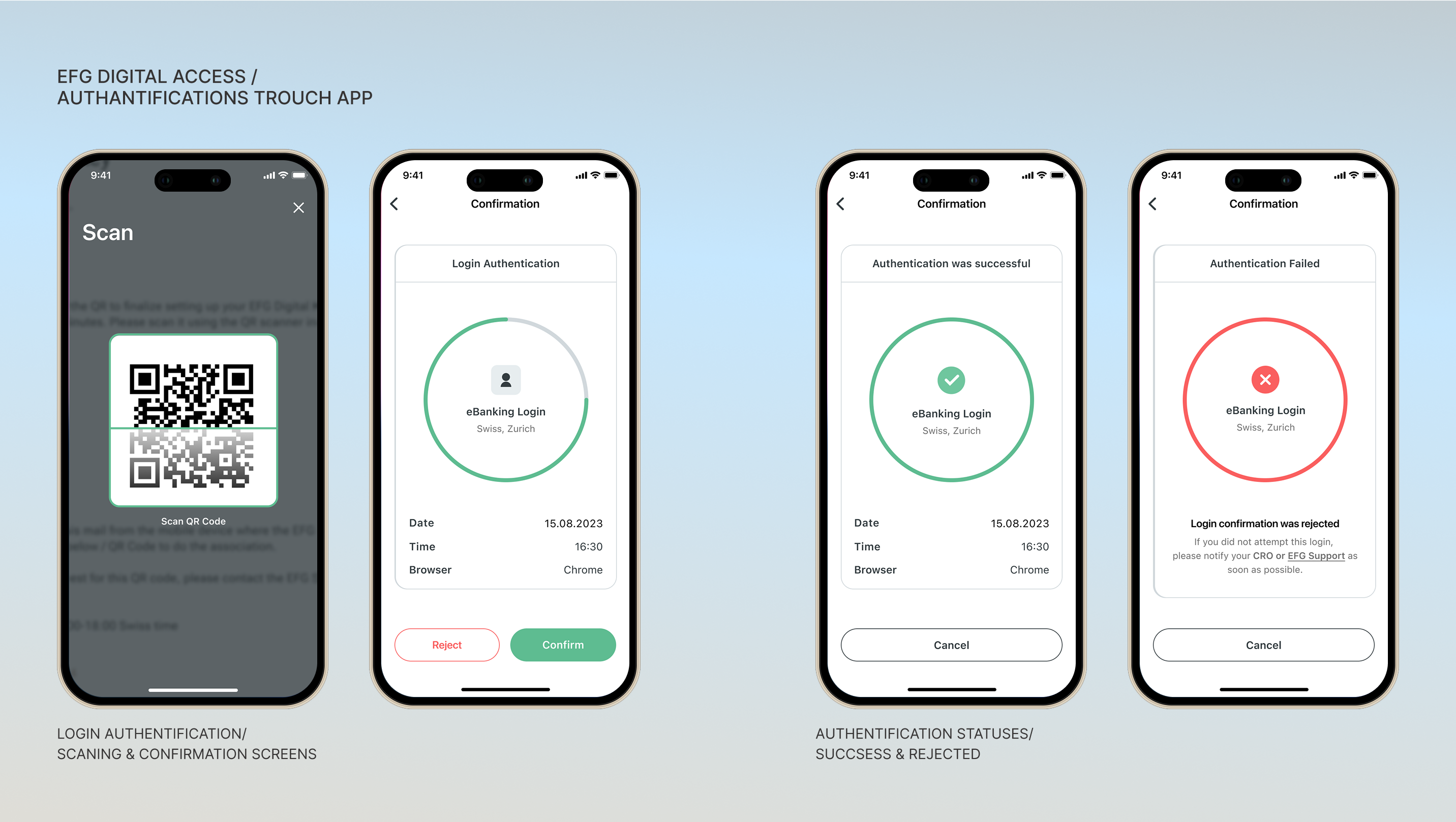
Solution
The redesigned login experience emphasizes clarity, trust, and streamlined fallback.
Component reuse: login, input, error, and feedback components built into a small auth design module.
Outcome
REFLECTIONS:
This project reminded me that login flows — often considered “boring infrastructure” — are critical user gateways. Small friction, unclear messages, or abrupt errors can break trust and retention. Moving forward, I’d release staged A/B tests for error messaging variants and further collect analytics on drop-off points to fine-tune flow performance.